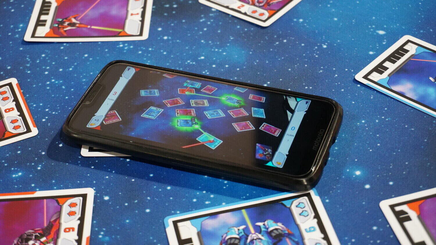
In May this year, we made available a new free print&play of the game Light Speed, supported by our computer vision software. Light Speed is a real-time tabletop shooter in which players physically orient cards to aim at enemy spaceships. In the original version, the battle resolution was handled with rulers and counters, while now you simply need to send a picture of your table to a bot on the free messaging app Telegram.
In this article, I reorganized the attempts, considerations, and changes that influenced the Light Speed bot to its current form. Although technology is a cornerstone of this project, I only briefly mention how the technical component has evolved to talk more about the player experience and game flow.
Many of the considerations come down to how good design should be able to shape the overall player experience, which is a universal game design and development topic.
If you have Telegram, you can activate the bot and take a spin with the test picture before reading the article.
Technology and design of the cards
We wanted to identify the location and type of each card in a Light Speed game by analyzing a picture taken by the player from any perspective and without relying on fixed anchor points, such as a mat or a board.
Summing up a beautiful and even somewhat adventurous story, we focused first on card detection and then on card classification. As a prototype development choice, we created a recognition framework based on codes and classical computer vision methods, thus avoiding the need to undergo neural network training at each iteration and new design.
Much of the development was devoted to optimizing and improving reliability. It was necessary to make it very rare that the picture taken by the player did not function and, in case of failure, to make it clear why this happened in order to allow the player to correct the issue in the following image.
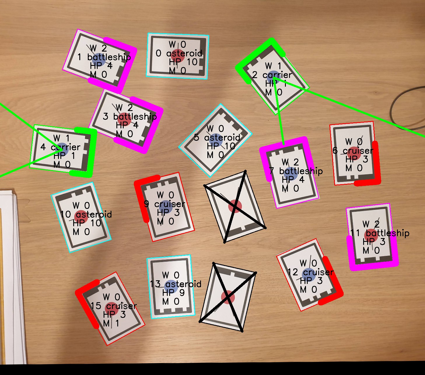
Already at this stage, we made choices that influenced the player experience. The game components had to be fit on three interconnected fronts:
- card readability – crucial in any game and even more so in a real-time game,
- aesthetics,
- reliability of the software.
While the first two points are common to developing any good board game, the third is unexplored. How to include the recognition code in the cards without making them look like a menu during covid times? How to guarantee sharp contrast on the game elements without turning each card into a street sign? How to prevent the graphics from hindering the software’s detection of the card?
After several iterations supported by the author of the illustrations and layout, Alberto Cariati, and our alpha testers, we converged to a functional configuration. We integrated the code into the card in the fashion of a vintage console cartridge. We printed a double border to ensure contrast regardless of the tablecloth used by the players. As for the laser beams, the compromise was to truncate them once they reached the innermost edge of the paper.
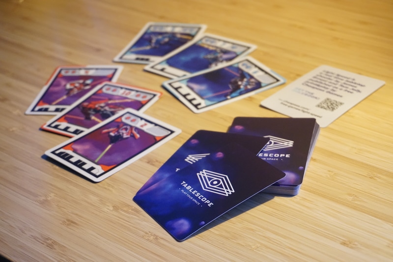
While there is still room for improvement, the over 1,000 games played with the bot confirm that the usability threshold has undoubtedly been met.
Assumption wins, assumption loses
Now we come to the hard part. I tried to be as honest as possible about what we thought were sensible assumptions and instead turned out to be incomplete, ineffective, or wrong.
The goal we were trying to achieve was clear. After addressing the challenge of calculating the battle resolution from a picture, we had to find a way to communicate this information to the player.
For each assumption, I also write about the evolution of the bot in that regard.
1. Rectification
No, it is not a medical exam, but rather the operation that transforms a photo of a flat surface from any perspective into the one seen from above.
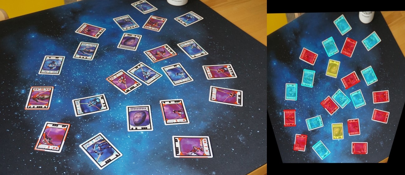
We started with the belief that the best viewpoint to show the game’s resolution was the top view. After all, in a board game, the cards are flat on the table, and players look at them from an elevated perspective.
Precisely, ‘from an elevated perspective,’ not from above.
Also, pragmatically speaking, the rectified picture usually has a trapezoidal shape which is more difficult to display on a rectangular screen without first processing it.
In addition, not rectifying the image offers more control to the player and incentivizes them to shoot more carefully. If I know that it is on my photo that the software will display the game information, I will choose an appropriate perspective and make sure that all elements are clearly visible in the image.
Based on these considerations, all resolution modes on the bot, whether based entirely on visual feedback or only supported by it, visualize the game result from the same perspective as the photo taken by the player.
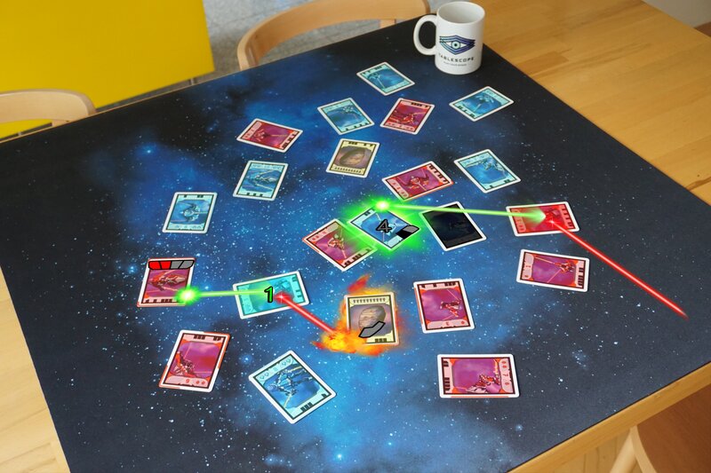
So better top view or perspective view? Like many game design questions, it depends on the experience as a whole. The answer might be different if the cell phone remains in the player’s hand after they take the picture or if I imagine it positioned horizontally in the center of the table during the resolution.
2. Representation by images
We had a screen: we had to use that to show the result of the game to the players.
As it soon came out during testing, the visual representation of information, in addition to not being the only one possible, must be adequately supported. An inspired playtester planted in our head the idea of a nostalgic commentary in the 1990s FIFA style.
Developing a quality audio experience takes considerable time and resources (which we will probably be investing in future iterations). Still, a similar direction can manifest through intermediate routes.
We have followed this path for the ‘Commentary’ and ‘Fast log’ modes currently supported by the bot. In both cases, one of the players describes the action to the others, either by reading the natural language text of the Commentary or by translating the icons of the Fast log. Images can still be summoned for reference and support, but the players decide how and when to use them according to the needs that arise at the table.
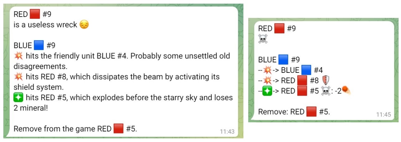
The visual medium is clearly powerful, but it must be adequately supported if we want to embed it into a shared ‘tabletop’ experience. How to ensure that all players are following and understanding the action? When to move on to the next picture/animation sequence without a mechanism that allows the playgroup to control the pace of the resolution?
3. Comprehensiveness of the resolution
Early in the work, we began to build around the assumption that the resolution of the game should necessarily be described, explained, and shown in its entirety.
This belief was derived from how players normally handle a board game. To determine and understand the outcome of an action or the result of a mechanic, one must take up and actively manage all aspects of it. In fact, there is no one else who will do it for us, and the correct outcome of the game depends on being comprehensive and not leaving out rules or events.
This is not always the case in a digital hybrid game. After taking a picture of the table at the end of a Light Speed game, within seconds, the computer will know all the details about the battle resolution.
Such awareness provides an opportunity to retroactively organize what we want to show the player.
We are still exploring this possibility but have already tried to exploit it in the ‘Points and higlights’ mode currently supported by the bot. This is a resolution option in which players are shown the final score (and thus the winner) and the visualization of the two highlights of the game, chosen by the software based on the amount of points scored and the impact on the following rounds of the game.
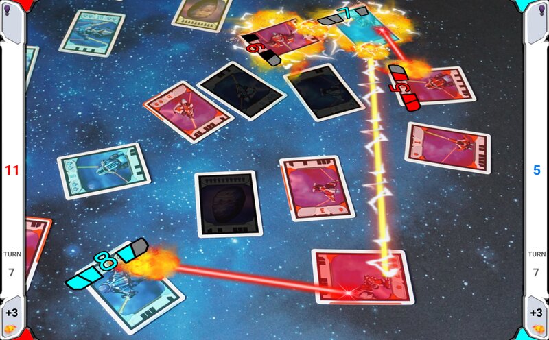
If involvement and understanding of the game action are non-negotiable, pedantry in resolution is no longer strictly necessary. Designers should handle this statement with caution but the opportunity to distill an even more intense and concise gameplay experience, freed from exhaustive detail management, is certainly tempting.
4. Identifying the cards on the table
More than an assumption here was an underestimation of a problem. Without pondering too much, we assumed that the player would be able to create a relationship between what the cell phone shows on the screen and what is on the table, and thus navigate their way through the resolution.
Looking back, it is almost touching how naïve this assumption was.
From the games played during the first festival in which we participated, we realized that little worked out of the box. Without proper guidance, players would have to rely on their intuition about handling the information on the screen, and many would not get a positive experience out of it.
On the spot, we temporarily patched the bug by playing ourselves the Game Master role. Still, it was clear that we needed other ideas to make the experience replicable regardless of our presence.
The Commentary and Fast log help to address this issue as well. In particular, the Fast log shows the player, in addition to the icons describing the corresponding initiative turn, an abstract representation of the cards still in play, a kind of supporting radar for finding the game elements on the table.
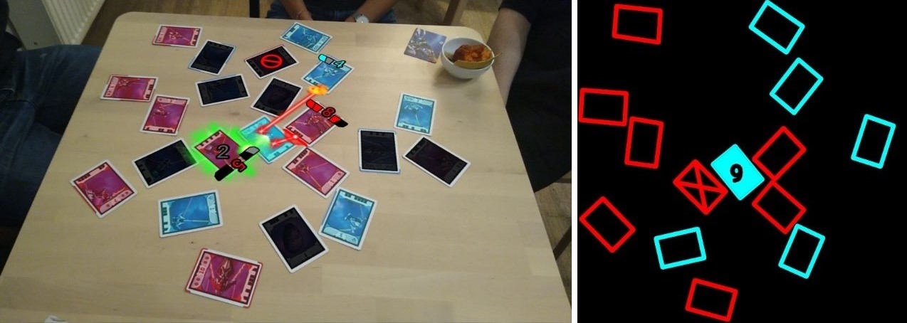
We recently reformulated also the ‘Slideshow’ mode, a gallery of images to be browsed by sliding your finger across the screen.
Without guidance, players were not quite sure what to do with this series of images.
However, all that the mode needed to get fixed was to explicitly clarify that the cell phone had to be placed on the table and oriented with respect to the cards in the same direction as the player took the picture. This way, an action in the upper right corner of the screen corresponds to the cards in the upper right corner of the table, making it easier to find the spaceships involved.
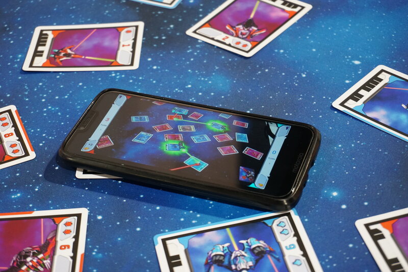
Developing the right tools and enabling players to use them are sides of the same coin, and both are crucial in designing the game experience.
5. Graphical representation of the outcome
After tackling the technical challenge of computer vision, we convinced ourselves that our tech was so incredible that it would justify rough graphics in the representation of the game results.
In the first version of the Telegram bot we fed to the alpha testers, the resolution consisted of a sequence of rectified images, a few rough lines representing the laser beams, and the players’ points as caption.
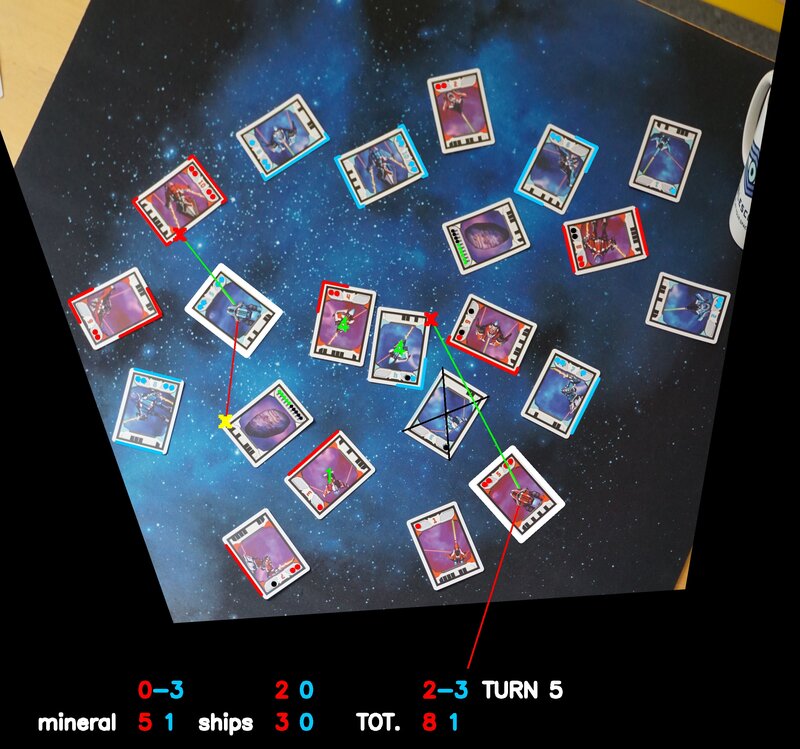
So far, so good. The alpha prototype was only a preliminary test. However, since the project was intended as a free print-and-play, we hoped to struggle as little as possible on the graphical aspect of the software and to be able to work out a final version close to the preliminary one.
The chickens came home to roost rather quickly when we remembered that what we were trying to accomplish was not a proof-of-concept for the technology but an actual game experience, however demonstrative.
Based on this, the mismatch between the advanced art development on the playing cards and the rough graphics of the software was striking.
In addition to the aesthetic factor, many redundant or irrelevant elements weighed down the interface. A fortuitous and mystical meeting with the expert of interactive experiences Ivan Hamarić at Spiel in Essen awakened us from our faulty dream, besides sending us home with one more friend.
In short, we went back to work to make the bot’s output more streamlined and effective. Most importantly, we added explosions.
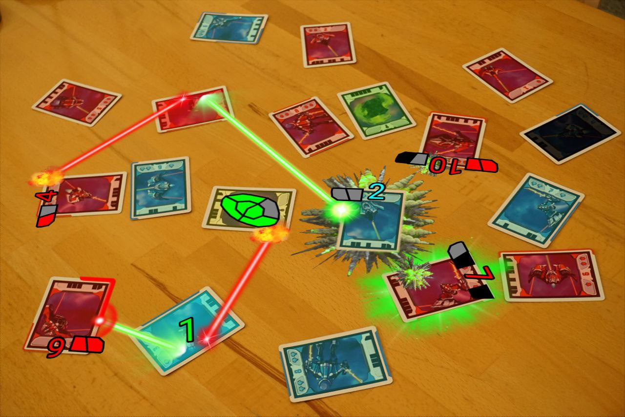
The moment the technological medium becomes part of the game, every aspect can contribute to or weaken the experience. The graphical/aesthetic one is no exception.
Figures of the game modes’ usage
An exciting aspect of a digital hybrid board game lies in the opportunity to collect some usage data. To date, 301 active users outside Tablescope have sent 1307 images to the bot. On the last 781 images, we tracked the game modes chosen by the users with the following results:
- Points and Highlights: 137
- Slideshow: 201 [this mode has not always been available]
- Commentary: 121
- Fast log: 322
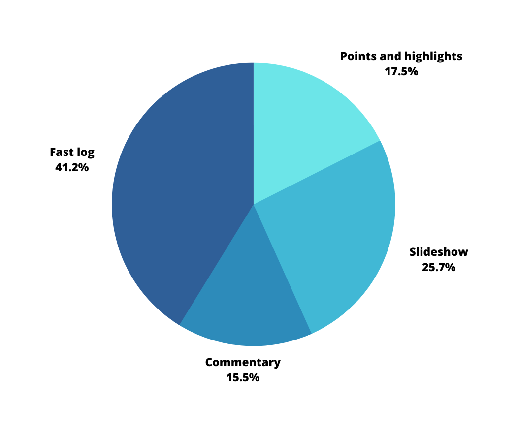
The data are in line with the predictions we made. Despite taking the most development time, we designed the Commentary mode to support first-timers and onboard new players, so it was reasonable to expect that users would employ it mostly in such situations. The Fast log and the Slideshow were designed as standard game modes, and the figures show that players used them as such. Somewhat surprising is the 17.5% of the Points and Higlights mode, which confirms the feasibility of a more distilled and synthetic approach.
Conclusions
That’s quite a parade of assumptions that missed the target. Given that we are trying to bring something new to the table, we should have been concerned about the opposite. Again and as always, playtests and feedback from fellow game designers and players have been the main compass of development.
The Telegram bot tool has been invaluable, but we now want to free ourselves from the limitations involved and work on an actual app where we can continue to build on the lessons learned and feedback received.
We are working on a new commercial version of Light Speed to be brought to Kickstarter next year. While it has mostly been technology that has so far adapted to the game, in the coming months, we are also going to question various game design aspects to make them native to the new hybrid nature of the game and the possibilities that come with it.
And what about you? What assumptions did you take for granted in developing your project to find yourself proven wrong?
Related contents
You can get Light Speed’s free print-and-play by signing up for the Tablescope mailing list. Further behind the scenes on the project (more from the business side) can be found at 2 Pros and 2 Cons for a Start-up Developing Hybrid Board Games. If you want instead to read about an unsuspected match involving board games, go to Mozart, Board Games, the Smartphone.

